This main purpose of this demonstration is to showcase the method, concepts and presentation themselves; rather than creating a final logo.
This a 5-hour, one-shot, one-direction design assignment; this is NOT the result of a real process of designing a logo with/for a client.
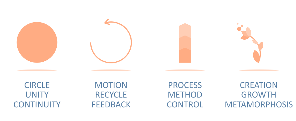
After analyzing PIONEER VISION and ROYAL VISION logos, and the given approach and theme, I added the following concepts to AD VISION logo:
- Method, Process and Control
- Creation, Alchemy and Metamorphosis
- Integration between Advertising and Media divisions
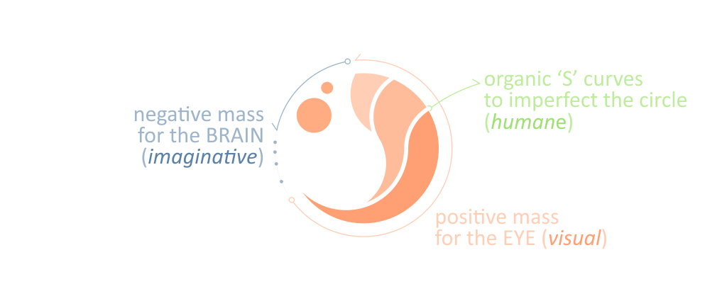
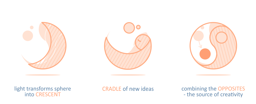
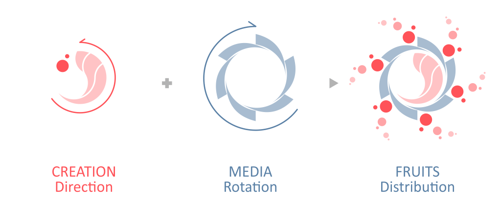
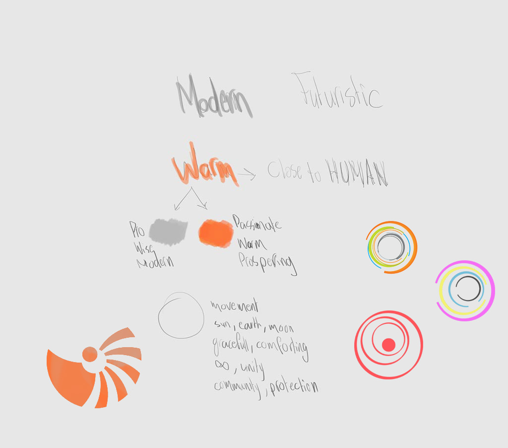
Concept
Resulting Symbol Variations

Final Symbol

Symbol Analysis and Side Benefits
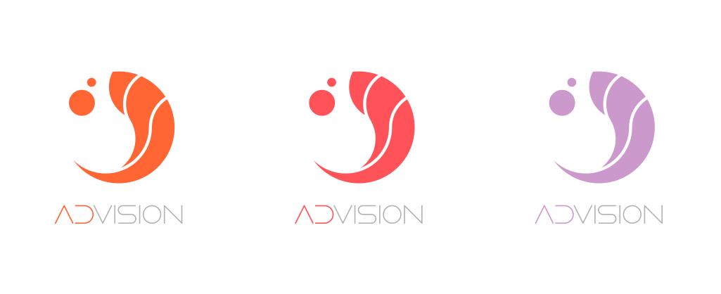
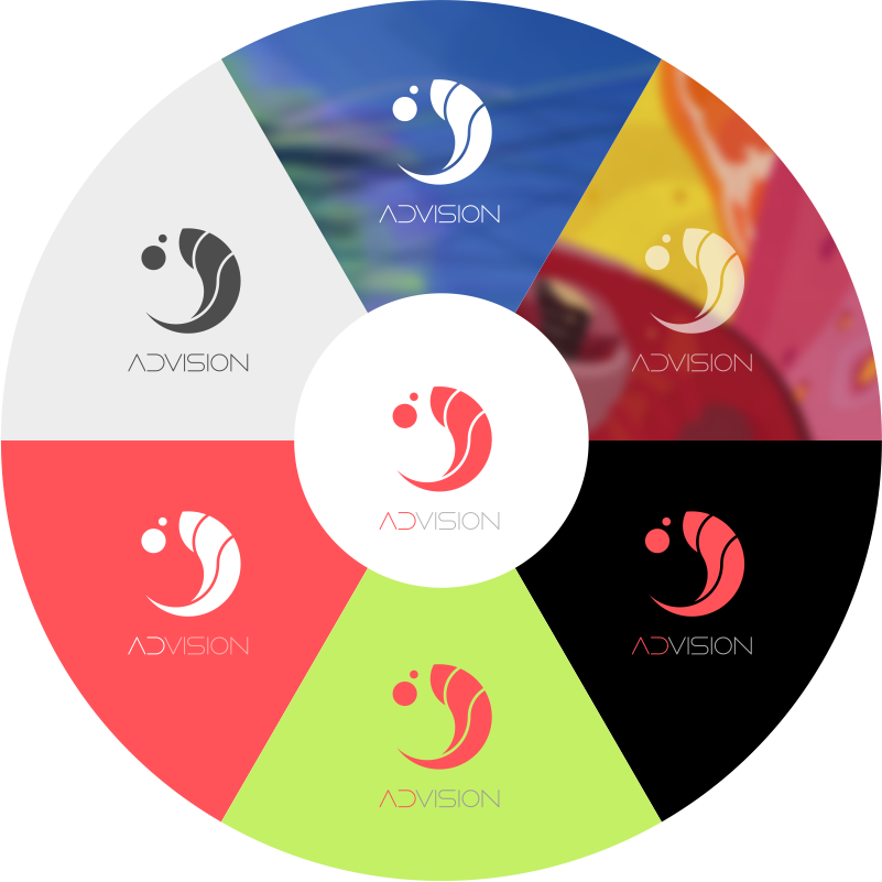
Colors and Logotype
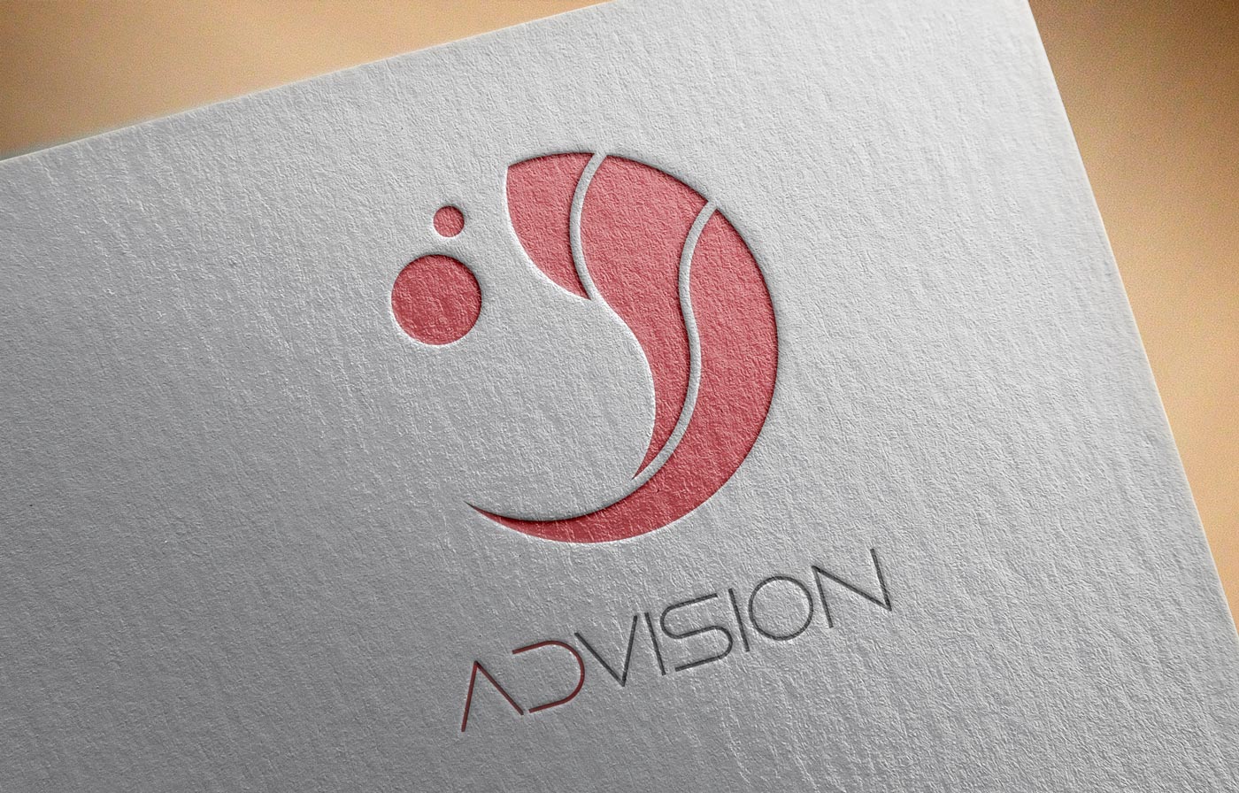
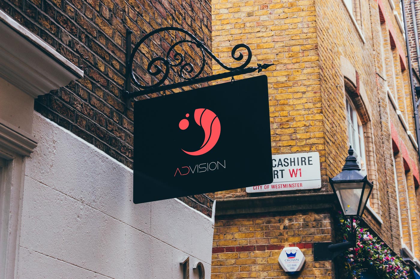
The Logo in Action

Integration
The illustrations below show how the logo was thought of as a mechanical part integrated with the other parts of a machine.
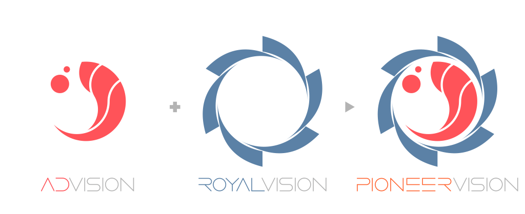
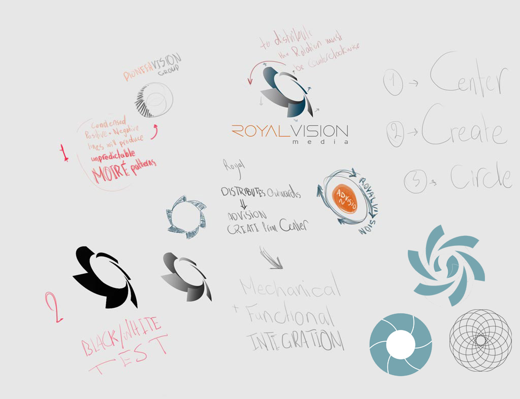
Taking the physical laws of the real world into consideration, AD VISION part was designed as a core creation part that fits in the center of the ‘distribution fan’ of ROYAL VISION . Resembling a pepper grinder, AD VISION process bears fruit counterclockwise and ROYAL VISION’s fan revolves clockwise pulling the fruits through the channels and spreading them.
Other Options and Sketches

Comments on the logos
PIONEER VISION
Beside being hard to reproduce on different mediums, the condensed positive and negative lines will produce unpredictable Moiré patterns.
ROYAL VISION
The 3D representation of the logo is unreal i.e. it does not represent real material engraved, embossed or cut.
Prepared by Ahmad Ajlouny
Proposed for AD VISION – a new advertising company under PIONEER VISION Group
February 2017